These are genre conventions compared. For my music video I chose pop therefore I tried to use, develop and challenge the conventions of existing pop videos that I had analysed.
For my A2 media coursework, by following conventions that I have researched from existing products, following my genre of pop, I’ve attempted to make my work along side my music video and the follow up work as creative, skilled and professional as possible. In some ways I have devolved upon original forms and conventions in my own work but I have also challenged conventions by coming up with my own ideas that are as creative as possible while also fitting the genre. As my genre is pop my music video will stereotypically follow major conventions of pop culture, for example, bright colour, outgoing costume and a certain creative edge that is bold and fresh for the audience. For my evaluation I will discuss how my music video, digipak and magazine advert use and/or challenge forms and conventions of real media products.
For my music video I chose to create my own video to Lily Allen Sheezus. There is a current music video to this track that i researched myself. Even though the video influenced me to chose an abstract concept I did not exactly follow this music video. After researching current music videos I was able to apply my knowledge of the appropriate forms and conventions into my own work. After producing my music video I then uploaded it to Youtube which made it to be viewable to the public and I could also receive audience feedback from this.
Music video
I chose to have an abstract concept for my music video. By using and developing on existing conventions of a pop music video I recognised that the style of my music video would have to be cool, colourful, vibrant and edgy. Keeping up with pop culture I recognised that I would have to keep my video current and be creative with my editing techniques.
Colour - By analysing current music videos I recognised that the colours I used within my music video had to be bright and vibrant. Therefore I used locations that featured brightly coloured graffiti, this gave the video a certain edge and used the conventions of colour which I developed on by also adding graffiti into the theme of the video. To add to this I also used editing effects onto the video which included a negative effect which changes the colour within certain scenes of the video.

Costume - In terms of costume I also wanted to keep it fairly colourful by using a range of girly colours. Typical costume for a pop music video which is produced by a popular female is cool and quite edgy, for example, ripped shorts, fishnet tights, crop top and boots. Artists like Jessie J and Little Mix are prime examples of this particular style. For my music video I decided to challenge these typical conventions. I decided to keep my costume quite feminine and girly. I chose floaty skirts and cute crop tops, in a range of colours including muted pinks and purple. I decided to do this as the editing of my video and the locations within my video were quite edgy and more masculine. The lyrics to the video are female focused therefore I wanted to keep a part of my music video feminine.
Location - Location wise I chose to use the conventions of a pop music video wisely. I chose multiple urban settings within my local town. I chose locations with plenty of colourful street art, this gave the video some street culture and a youthful, rebellious vibe, just like the lyrics connote.

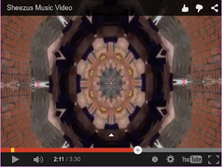
Editing - Finally when it came to editing my music video, I wanted the video to be edgy and to flow along with the music. In terms of speed, I used slow motion and speed up editing, I did this to fit the pace of the song. I also used creative editing techniques to create different illusions that would make a normal location shot more interesting and fit the vibe of the song. During the lip sync of the video I also used effects on the models to fit the general conventions of an abstract pop video. Looking at the current Sheezus music video, they too used simple effects to be creative in the visuals of the video, therefore I developed on this by using a different effects that would fit my music video, including the negative effect.


Magazine advert


Looking at a current pop music magazine advert on the left, the main focal point of the advert is a powerful imagine of the artist. Following this convention I also wanted a main image of my models at the top of my advert. This is striking to the audience as they can see who the main artist is and get a bold image of the style of the artist and this may connote the style of the single. Leading on from Jessie J, I also chose bold makeup. This is another convention that adds tot the effectiveness of the image. By using a dark lip this stands out to the audience and connotes a strong image in terms of the female. Dark makeup can give the audience an idea of the message the artist is wanting to put across, for example, Sheezus is a cool, edgy song with powerful female driven lyrics, therefore needing bold makeup to reinforce this message. Striking, 'out there' makeup is a huge convention in the female pop culture world as body image is a very large part of the industry.
Following on from the black colour scheme of the model I also have chosen a black backdrop to my advert, this makes the rest of the text on the page stand out, just like the current advert has. Choosing white text and one other bold colour makes the main sell line stand out, for example, the neon green banner on my advert. The font is also quite bold and structured, therefore standing out to the audience and the theme of the music video.
In terms of analysing current music adverts, I have challenged the conventions of the second image on my advert. I have chosen to use a location shot at the bottom of my advert. I did this as my music video is abstract therefore I wanted a different shot than just a portrait image as I wanted a focus of the theme of the shoot as well as just the models. This type of image is more of an indie music advert convention as they focus on abstract images to create more of an art based shot, this links into my abstract concept of my video.
By having social media at the bottom of my advert, this allows the audience to find the artist and any other information about the single on the internet, for example, Twitter, Facebook and Youtube. By providing a website this all allows the artist to provide a wide range of information while being able to portray their own style through the theme of the website.
Digipak
 Looking at a current digipak, examples of conventions they have used are a wide range of colour, bold font, one main image, social media information and a barcode. Using these convention I too have all of the above, although I have developed upon these conventions as I have used more than one main image. I decided to do this as I chose multiple locations for my shoots. By having multiple locations, different sides of the digipak can have different themes making the digipak more interesting for the audience. From past experience of my own, an artist that has put in multiple shoot images into their digipak it becomes more of a memorable piece to keep from the artist, rather than just a case to keep the CD in. Colour as a convention, I have challenged as I have used multiple styles within my shoots. For example, quite a minimal shoot using just black with the models costume and makeup has an impact as black connotes quite a powerful image. I then used more of a feminine costume choice and colour scheme in another one of my shoots as I used the colours pink and purple within my shoot.
Another convention of the digipak is the track list. By providing a track list the audience can view the songs on the back that are going to be on the CD. Colour and font conventions of a pop digipak are bright colour and bold clear font, I have used both and the theme of this links into the style of the genre. I picked neon green as this is a 'in you face', cool colour. By the green being neon it keeps the style of the digipak young and current.
General conventions such as social media information and a barcode allow the public to find out more about the artist and to be able to actually buy the product themselves, therefore these are vital and I am following typical conventions by providing them.

My advertisement to the general public


These are how my advertisement would look if I advertised it in the general public. The neon green banner is the most predominant to the eye as you first catch eye of it. As it says 'FEATURING NUMBER 1 SINGLES' this is what should be popular to some of the public already therefore drawing them in. The second most predominant feature is the sell line of 'DEBUTE ALBUM', this is what the whole advertisement is trying to promote therefore this is an advantage.
No comments:
Post a Comment